
Pinch, zoom and scroll sideways
Text is tiny, tables overflow and visitors have to zoom just to read a phone number.
Most of your visitors now arrive on a phone. We rebuild outdated, desktop-only websites as fast, mobile-first sites that adapt to any phone, tablet or laptop, while keeping your content, URLs and Google rankings intact. 21 years of web development, tested on real devices.
Signs your site isn't mobile-ready
Google indexes the mobile version of your website first, and most buyers will judge you on a five-inch screen. A desktop-era site costs you both rankings and enquiries.
Text is tiny, tables overflow and visitors have to zoom just to read a phone number.
Links sit too close together and form fields are fiddly, so mobile enquiries never get sent.
Full-size desktop images and heavy scripts load on phones too, so pages crawl outside office Wi-Fi.
Search Console reports mobile usability and Core Web Vitals issues, and rankings slip as a result.
An old mobile sub-domain shows different content, splits SEO signals and doubles every update.
Layouts tuned for one laptop size stretch, overlap or leave huge gaps on iPads and wide monitors.
Responsive web development services
Whether you need an outdated website converted or a new mobile-first build, every page is designed for the smallest screen first and enhanced as the screen grows.
Layouts, navigation and calls to action planned for thumbs and small screens first, then scaled up to desktop.
Read more about Mobile-First DesignRebuild an old fixed-width or table-based website as a fluid, responsive site without losing content or rankings.
Read more about Desktop-to-Responsive ConversionCSS Grid and Flexbox layouts with breakpoints set by your content, not by a single device size.
Read more about Fluid Grids & BreakpointsEvery template checked on real Android phones, iPhones, iPads and desktop browsers before launch.
Read more about Cross-Device & Cross-Browser TestingResponsive images, lazy loading and lean code so pages load quickly on mobile data.
Read more about Mobile Speed & Core Web VitalsReadable type, sufficient contrast, tap-target sizes and keyboard support for every visitor.
Merge a separate mobile sub-domain into one responsive site with redirects and a single set of content.
Campaign pages and HTML email templates that render cleanly in mobile inboxes and browsers.
A component library of buttons, cards, tables and forms that adapts automatically, for your team to reuse.

Mobile-first design
Starting with the smallest screen forces clear priorities: what the visitor needs, in what order, and how they contact you. We design thumb-friendly navigation, sticky call and WhatsApp buttons, and short forms, then add columns, imagery and detail as screens get wider.

Convert an existing website
If your current site's content and design still work on desktop, a responsive conversion can be faster than a full redesign. We audit every page, rebuild the templates with modern, fluid CSS, carry across your content and keep the same URLs, or map 301 redirects where they must change, so search rankings are protected.
Fluid layouts & breakpoints
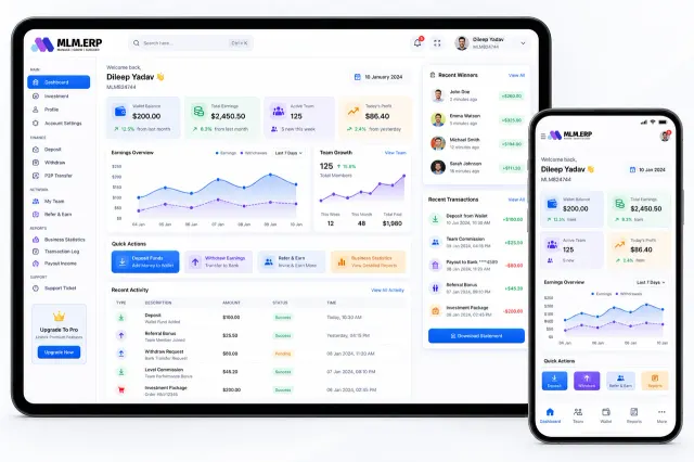
We set breakpoints where your content needs them rather than for one popular device. Dashboards collapse into cards, tables become stacked lists, sidebars move below the content and navigation turns into a bottom bar, as in this Sysfo product that runs on the same code on a tablet and a phone.

Cross-device testing
Emulators miss problems that real devices reveal: notches, on-screen keyboards covering inputs, Safari quirks and slow mid-range Android handsets. Every template is checked on physical devices and the main browsers before launch, and issues are logged with screenshots and fixed on a staging site.

Mobile speed & Core Web Vitals
A responsive layout is only half the job if the page still downloads desktop-sized assets. We serve correctly sized WebP images with srcset, defer non-essential scripts, inline critical CSS and cache aggressively, then measure Largest Contentful Paint, Interaction to Next Paint and layout shift on a throttled mobile connection.
What you get
Alongside the live site you receive the audits, test results and files behind it, so you can see exactly what improved and keep building on it.
Before → after a responsive rebuild
Rebuild plan
How a responsive rebuild works
A fixed quote after the free audit, a staging site you can check on your own phone, and weekly progress updates.
We test your current site on real devices and in Lighthouse, then share the issues and a fixed, itemised quote.
Content inventory, priorities for small screens and mobile-first wireframes for each template.
Templates designed and coded with fluid grids, responsive images and accessible components on a staging site.
Phones, tablets and desktop browsers in both orientations, with every issue logged and fixed.
Redirects, go-live, then Search Console and Core Web Vitals monitored for a month after launch.
Engagement models
Start with the free audit. It tells you whether a conversion or a full redesign gives better value.
Free
Find out exactly how your site performs on phones.
Fixed price
Keep your content and look, rebuild the code for every screen.
From a quote
A new design and structure, built responsive from the start.
Why Sysfo
We build data-heavy web applications that have to work on a delivery partner's phone as well as an office monitor, and bring the same discipline to your website.
Our own products, from milk delivery to MLM ERP, are used mostly on phones, so we design for small screens first.
Templates are tested on physical Android phones, iPhones and tablets, not only in browser emulators.
URL preservation, redirect maps and post-launch Search Console checks keep existing traffic safe.
Before-and-after Core Web Vitals figures show the real improvement on mobile connections.
Contrast, tap-target size, focus states and screen-reader labels follow WCAG 2.2 guidance.
If a conversion will do, we won't sell you a redesign. The audit shows which option gives better value.
FAQ
Responsive website development is building one website whose layout, images and navigation adapt automatically to the screen it is viewed on, from a small phone to a wide desktop monitor. It uses fluid grids, flexible images and CSS breakpoints, so there is a single set of content and one URL for every page, which is what Google recommends.
Usually, yes. If the content and branding still work, we can convert the existing site by rebuilding its templates with responsive HTML and CSS, then migrating your content and keeping the same URLs. If the site is very old or the structure no longer fits your business, a mobile-first redesign may be better value. The free audit tells you which.
It depends on the number of page templates, how much content needs migrating, any features such as forms, booking or a store, and whether a conversion or a redesign suits you. After the free mobile audit we give you a fixed, itemised quote, so you know the full cost before work starts.
A typical responsive conversion of a business website takes four to six weeks: a week for the audit and content plan, two to four weeks for design and development, and about a week of real-device testing and launch. Large sites with many templates or complex features take longer, and we confirm the timeline in the quote.
Responsive design means the layout adapts to any screen size. Mobile-first is the approach we use to get there: designing and coding for the smallest screen first, then adding columns and detail as the screen grows. It produces lighter pages, clearer priorities and better mobile performance than shrinking a desktop design.
Google uses mobile-first indexing, so it ranks your site mainly on its mobile version. Responsive website development removes mobile usability errors, improves Core Web Vitals and merges duplicate mobile pages, all of which support better rankings. It isn't a guarantee of position one; content and links still matter, and our SEO team can help with those.
No. A responsive website runs in the browser and adapts to the screen, but isn't installed. If you need features such as home-screen install, offline use or push notifications without an app store, a progressive web app is the next step. Our mobile web app development team builds those, often on top of a responsive site.
We test on current and recent Android phones and iPhones, iPads and Android tablets, and on laptops and wide desktop monitors. Browsers include Chrome, Safari, Edge, Firefox and Samsung Internet, in both portrait and landscape orientation. You receive the test log with screenshots before launch.
Yes. We are based in Lucknow and offer responsive website development to businesses across India and abroad. Audits, design reviews and progress meetings happen over video calls, and you can check the staging site on your own phone at any time during the project.
Get mobile-ready
Send us your website address. We'll test it on real phones and tablets, share what's holding it back and send a fixed quote for a responsive rebuild within one business day.